12.15 a.m.
got a bit of sorethroat. the colour of my tongue is pale. pimples popping out from my face = signs of kepanasan!!! O.O''' n i'd been staring at my comp screen the WHOLE day, chatting in the morning n doing my graphic work afternoon n night X.X my poor eyes~ gona put on pieces of cucumber later!
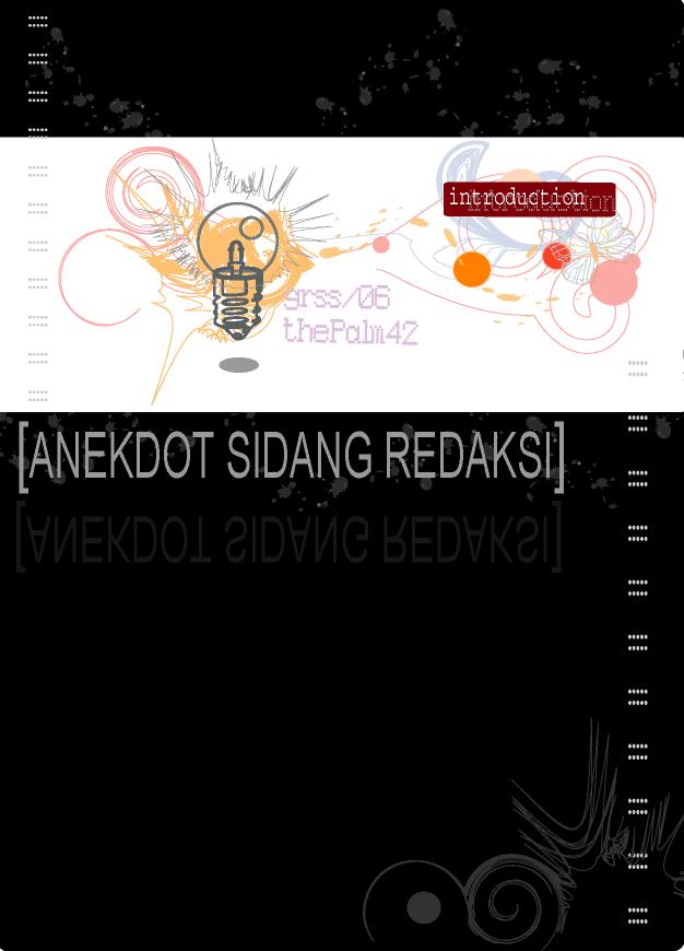
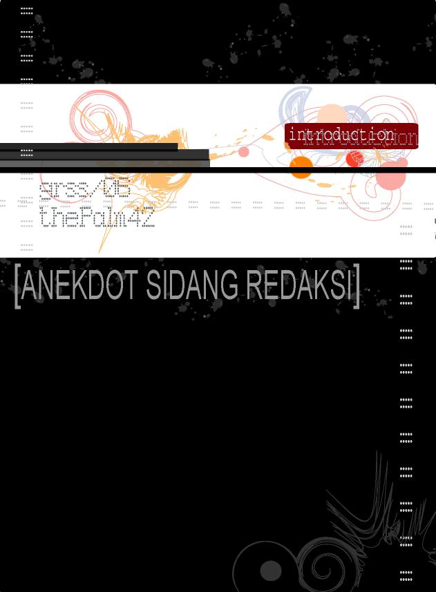
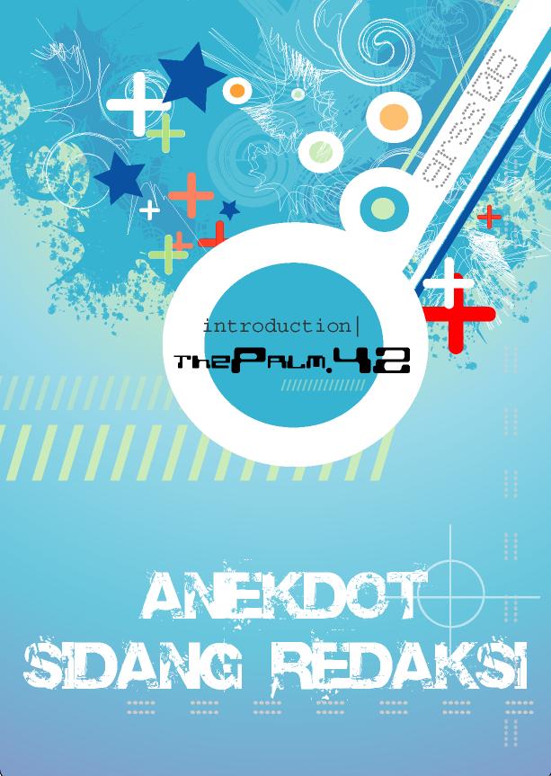
i'd edited my Anekdot Sidang Redaksi intro again..as my partner sed the previous one (the face with the wicked smile) is cheeky, so these r my final ones. i'm not going to edit them anymore (unless it's neccessary).
the duno wad style designs...

these r the vector style designs...


i'm going to sleep now. damn sleepy. n feel free to comments :)
9 comments:
Those Vector designs are super NICE! Wow, u r really something. wonder how u design em. Look very complex. Haha.
they took me a whole night to do X.X n guess wad? i'd discovered new buttons for sum super duper cool effects! :D
Here's my opinion on your designs.
First of all, all of them are great, but I guess they all can be improved.
For the first 3 donno wad style design, I think they are too dark and plain. And I think the "[]" on those wording is somehow distracting. Maybe you should add a little "bling bling" to the dark plain space. Among those 3, I like the first one the most. But I think you should replace the Anekdot wording on top of the whitespace instead of inside the whitespace. Try it and see.
The 4 vector designs are really nice. Among those 4, I like the first 2 the most. About the last 2, I think the pinky-yellow circle gradient in the middle somehow looks a little weird. But I really like the flowery thing near the Anekdot wording in the 4th design. It's cool.
That's my opinion la~ Not necessary you have to change according to what I say. I myself is a newbie in designing too. Maybe you can try and see. Good luck and happy holidays.
oooo~ thnx for the comments (^_^) n which software do u use to design?
btw, u can go to deviantart.com or flip tru sum international interior design magazines for inspirations. they hav great designs in there :)
oh, yea, forgot to tell u guys that me myself also dont really like the first 3..the black black one :p
wow! That's hell of a cool design!
blue! My fav color...:D
-The "dunno wad design", like others had mentioned, is rather dark. Maybe less of the dark side? :P:P JKJK! And the words "Anekdot Sidang Redaksi" is not significant enough, maybe cuz too much black.HEHE..but it's cool yea!
-The vector style is cute!Esp 1st two!! HAHA...I luv blue~but then, I think lah~ It would look better without the white color banner with GRSS on it, then it'll look more balanced. But the words here are great!!
Luv your designs mate~
-wenLi-
haha~ now i'm really thinking of chucking the black ones aside XD
i don't really do design. Just merely playing with boxes and font effects to create banner for my site. I can't do any of those cool designs like yours :D Oh, I use fireworks. Photoshop is totally out of my mind, since the PC im using is rather old. Very old. :(
oh ...i see. erm, y dont u go n get a new pc? or maybe upgrade it? n also get urself a super duper new hard disk. hehe.. :p
Post a Comment